Things don’t have to be this chaotic. There has to be another way.
Read MoreUI Design
Figma User Interface
Here are two (2) suggestions for Figma Designer to help make it a bit more user-friendly and magical to use.
Panel Expand / Collapse Animations
When toggling "Hide UI", the interface abruptly disappears and reappears (on the right side of Fig. 1a. )
It'd be delightful if the UI elements were swept away (dark green position graph) from the center of the screen and subtly faded out of sight. (light green opacity graph) as indicated below in Fig. 1b.

Fig. 1a.
Fig. 1b.
Responsive Panel Colors
Figma thankfully allows users to set a background color for the whole project, which is a welcomed feature coming from Sketch, which locks you into using a white background.
Unfortunately when using a dark background, the layers panel (left sidebar) and the inspector panel (right sidebar) are blindingly bright. Not only are they pure white, their typefaces and elements are thin and light.
To make the layer and inspector panels more readable, I propose that the UI of both change in accordance to the set background color of the project. I prototyped what this could look like in the column on the right.


Spotify
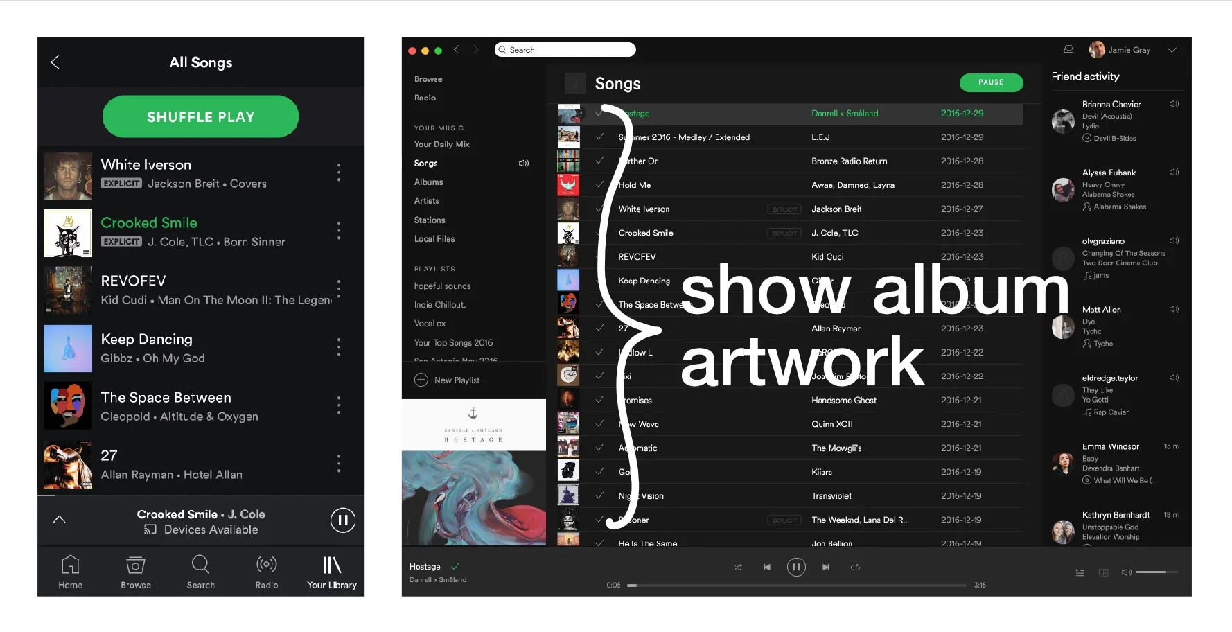
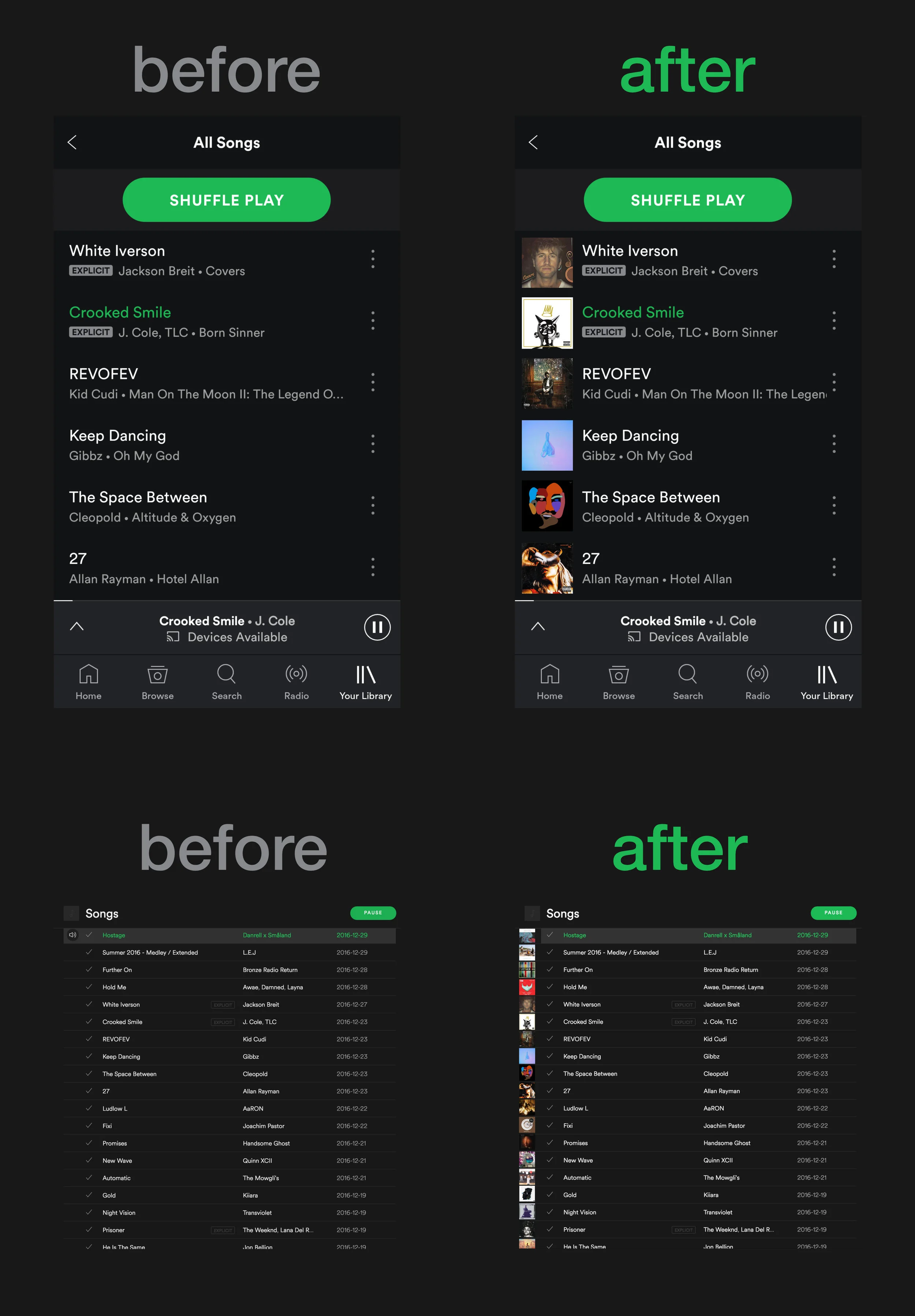
Show Album Artwork
Feature request for Spotify to show Album Artwork in the list view, to improve usability. This would allow users to quickly scroll through a list to find specific songs based on the color of the album, instead of trying to speed-read song titles.
Related links: Twitter thread with links to the Spotify Community request, where pretty much all of the comments are bashing Spotify for not having this feature.