To make it easier to share music with friends, I recommend Spotify take some hints from Snapchat's checklist interface, which - in my opinion - is part of the reason snapchat is so engaging; because the sending mechanism is so simple and powerful.
I'll walk through my UX design process workflow in this post, but if you'd like to skip to the completed designs, click here.
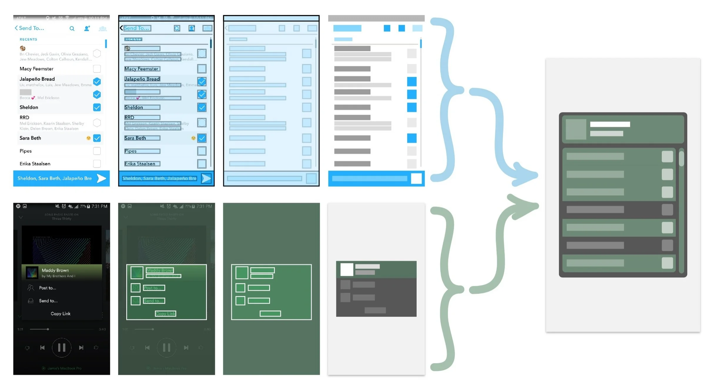
Overview of prototype workflow, combining and synthesizing existing elements to make new elements.
First I outlined screenshots of Snapchat. The checklist interface is incredibly simple, but I thought I'd build an outline of it just for fun.
Formal Analysis of Snapchat checklist.
After analyzing the visual architecture of the Snapchat interface, I outlined Spotify's "send" window. This helps me preserve the padding width between the edge of the screen and the window.
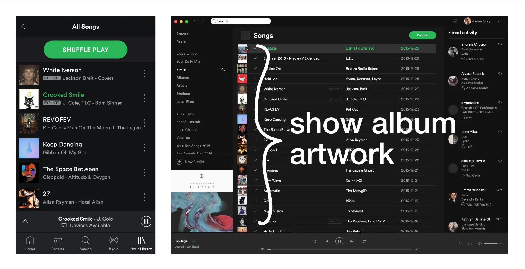
Spotify Mobile Share Window
To make these outlines, I use the rectangle tool, bright colors, and low transparency so I can see the background and the overlay shape. Once I get the shapes pixel-perfect, I add a high-contrast stroke to better visualize the shapes.
Page navigation showing the user path to the share menu.
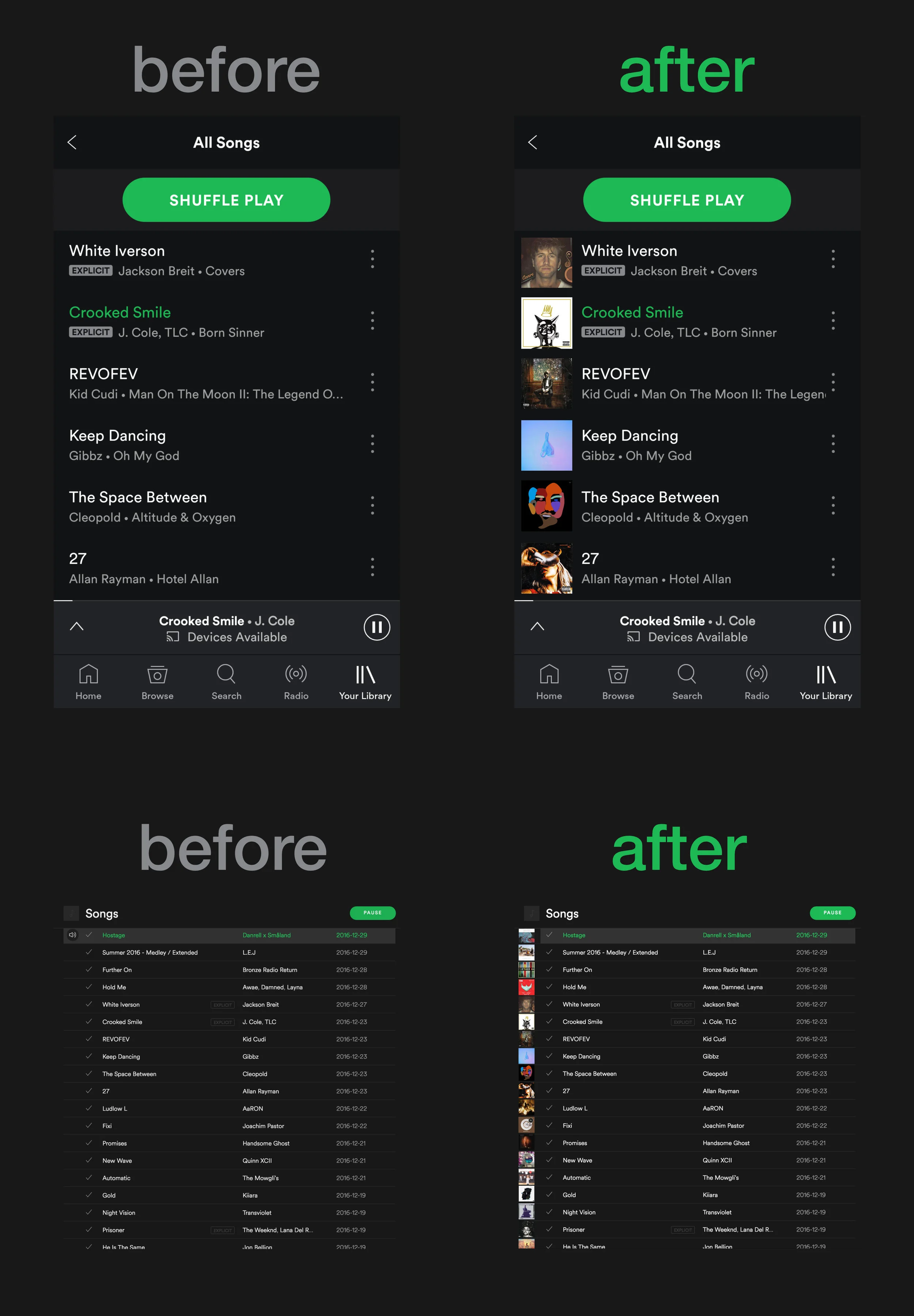
After revisiting the design, I made some minor changes to improve the visual continuity and overall prettiness of the checklist. I also added an extra "share to my feed" checkbox, to merge the functionality of the above "post to..." & "share to..." options all into one single interface, which requires fewer taps by the user.
A few iterations of the checklist design. #2 is simplified and cleaner, #3 adds a scrollbar on the right edge.
Please let me know what you think of this design in the comment section below, I'd love to hear your feedback and I'd be willing to make changes and credit the changes to you on the blog. Iterative design is about constantly improvements, and I'd like to incorporate that into this blog as well.