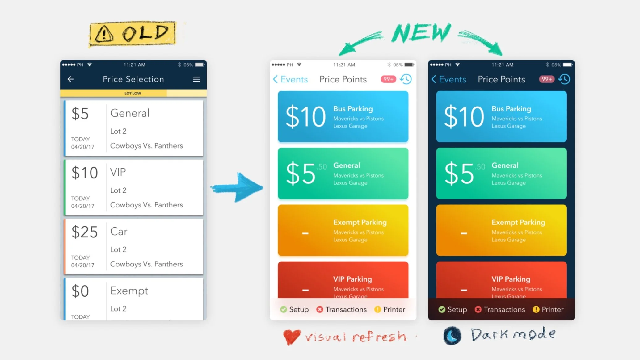
To make the photo viewing experience more immersive and delightful, Google Photos ought to hide the footer while scrolling, similar to how they already hide the header. (bottom orange bar and top orange bar, respectively)

This would increase the viewing window for browsing photos, and everybody likes when the UI steps out of the way to prioritize their content.

A digression: I was pretty impressed by Giphy when I went to make this gif. Great user experience and fun retro user interface design. 👏👏👏

Journal Sources: Note Mar 4, 2018