A proposal to familiarize users with the coming technological transition by showing them relevant information right next to where they currently summon their human-driven taxis.
Read MorePromoting Self-Driving Taxis with Google Maps
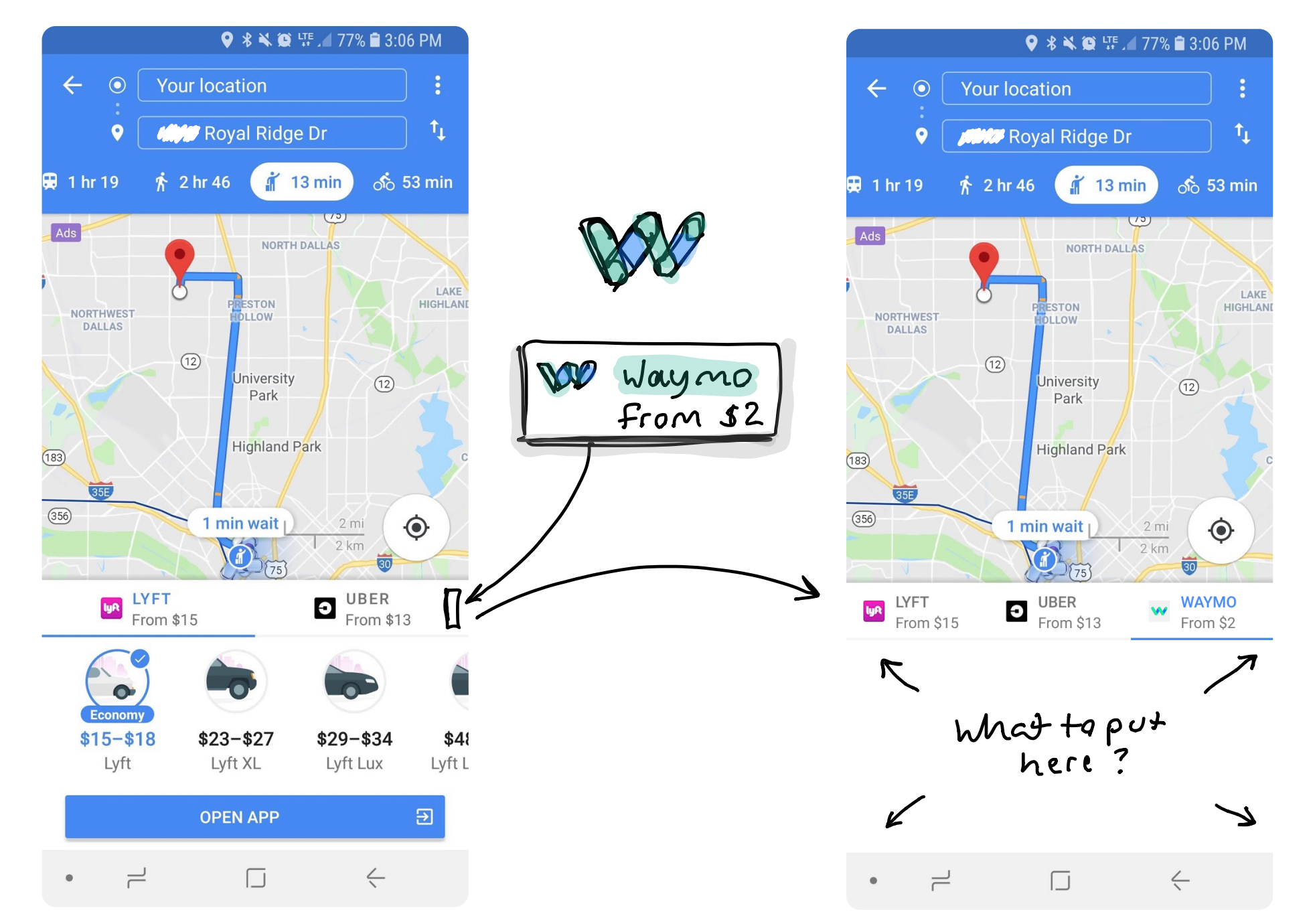
A proposal to familiarize users with the coming technological transition by showing them relevant information right next to where they currently summon their human-driven taxis.
Read MoreA conceptual outline for improving the visual detail of Google’s 3D imagery by combining it with other imaging sources such as Street View and contributor photos.
Read MoreA concept for Google to use their Street View imagery to figure out the positions of objects for the purpose of improving the positional accuracy of Google Maps.
Read MoreThe finder window should show unsynced folders, without having to go into preferences.
I use the Google Drive macOS Finder Plugin. In order to save local storage space, I don't sync all of my Drive folders to my computer. Unfortunately this means if I'm looking for something I can't find, I have to look inside my preferences pane to see if the file might be in an unsynced the folder.
A better system would be to show the unsynced items within finder, so I could explore the directories, and only download what I need. The unsynced folders and files could be shown in grey, and a right-click could give me an option to sync it to my local device.
Unsynced folders are shown in the preferences pane. This is great functionality, but it's not easily accessible. (read: user-hostile)
In addition to being hidden away, the preferences pane lacks the ability to show files inside folder -- again going back to my use case where I'm looking for a file I haven't synced.
Unsynced files / folders should appear in the finder window.
Here's a masterfully crafted doodle of a right-click menu interface that allows for the download of offline (greyed out) items.
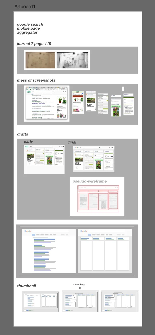
This is a user interface mockup for a search result page that previews fully interactive mobile pages, in aim to improve the speed at which users can access relevant information.
It's not perfect, and perhaps it addresses a need that's not there. But with a few tweaks, this could be A/B tested to validate its usefulness. Just an idea.
Heres a blockframe comparison between a typical search results page interface, and the proposed interface. This is useful to weigh the pros and cons of each, for example, the left can show more results in a single viewport than the right. However, the right allows people to look over the site instead of having to visit each individually.
Initial concept sketched in my journal.
Photo of my Affinity Artboard, which somewhat illustrates my workflow, as I work from top to bottom.